While some people like to observe other people around them and create scenarios of what these observed subjects are doing for a living, as a child I observed spaces I would peek into while walking the streets on my way back from kindergarten and later school. From an early age, I was fascinated by buildings and its inhabitants. What kind of people live inside those walls, what kind of life they lead, what they are by profession, but most of all I was curious about the interior design of these spaces. For me, it was like a game and inspired by that childhood memory I invite you to our first trip from the virtual visit series. Buckle up because we are going on a wonderful journey!
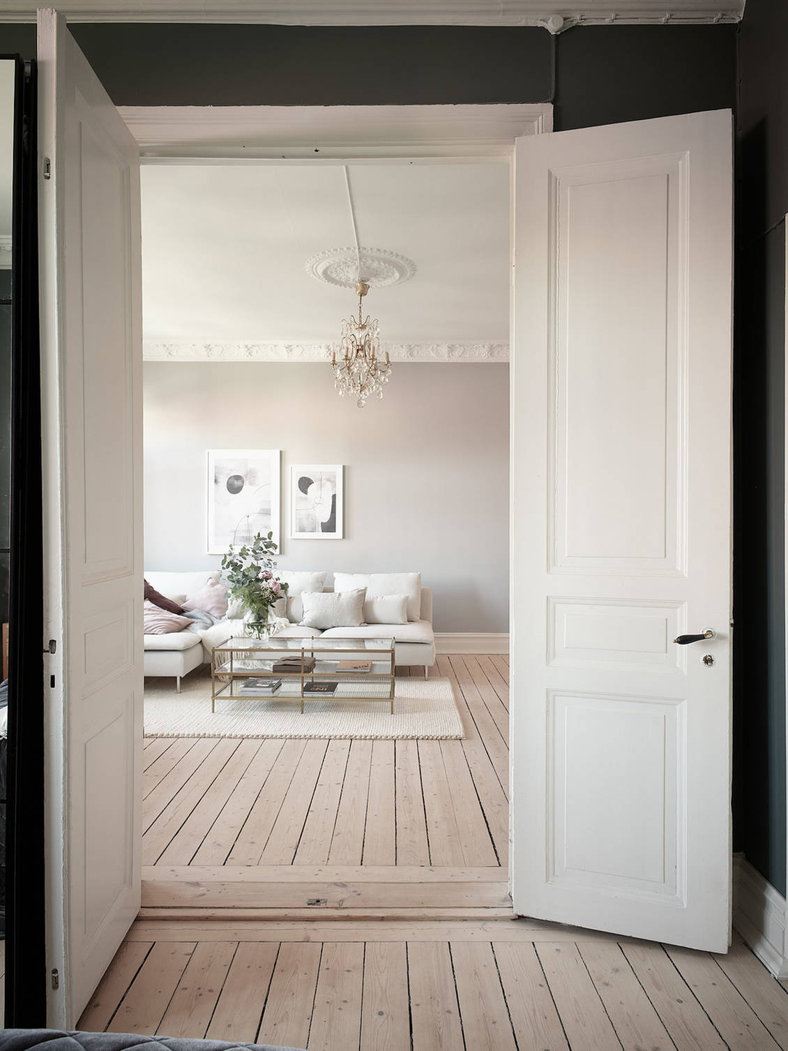
The first home that we will visit is in the city of Gothenburg in Sweden. The apartment is located in the Linnéstaden district in a building built in 1898 on the third floor and has a square footage of 62m2. Like all old Scandinavian apartments, this one is adorned with high ceilings that give a feeling of spaciousness, and in this way the existing 62m2 is further visually enlarged.
In the decoration of the apartment, mostly pastel colours were used, namely green, pink and various shades of white and beige color, which harmonise together perfectly. Every interior designer will use this trick and will use cohesive colours to make the visitor feel as if the rooms are much larger than they are. The feeling of spaciousness in the apartment is enhanced by the wooden floor that extends throughout the whole place and is left in its original form.
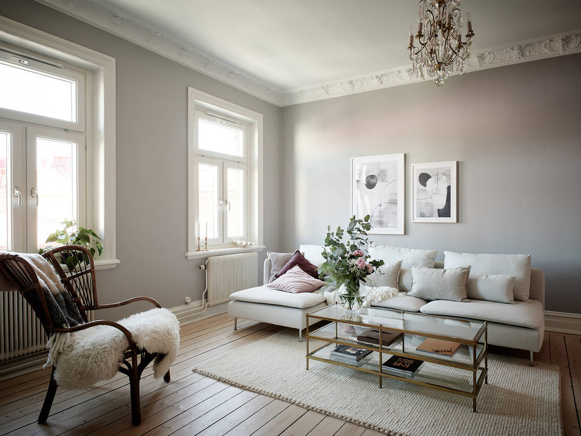
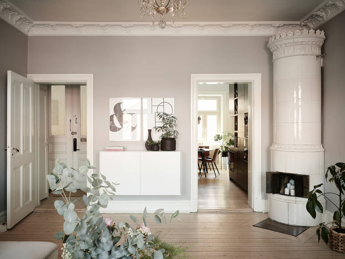
What can be noticed in this space is that everything is planned down to the last detail. All elements, from functional to decorative, work perfectly together and this is another trick that makes well-planned spaces look bigger. As you can see in the pictures, even the different materials fit together perfectly. In the living room for example, we can see linen pillows and a woolen blanket, two different materials that complement each other perfectly because they are from the same color palette.
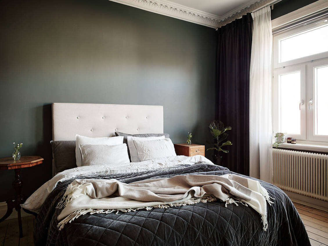
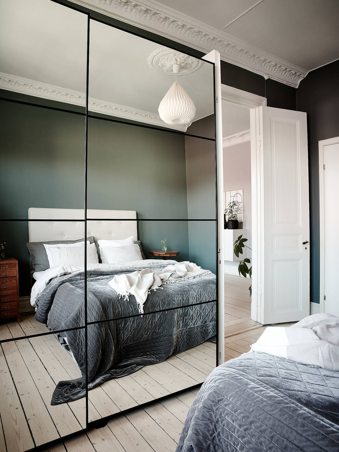
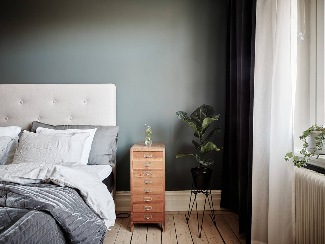
The bedroom is another example of perfect harmony. The headboard of the bed is in beige color, and in the same tone we have pillows on the bed. The color of the curtains again matches the headboard, blanket and pillows, although they are made of three different types of fabrics. This is what we should all strive for when decorating our homes, because in that way we achieve harmony, a sense of organisation and flow that will give us a sense of airiness. In this way, we will avoid impulsive shopping, which almost always ends with the feeling that the purchased product does not fit decoratively or functionally into the space. And don’t get me wrong, I’m not trying to advise you to have only three colours and two different materials in your home, but to put focus on the color shades of different products in the planning phase, so that the colours belong to the same family. This way you will avoid having 7 different shades of blue or 5 different shades of wood or metal.
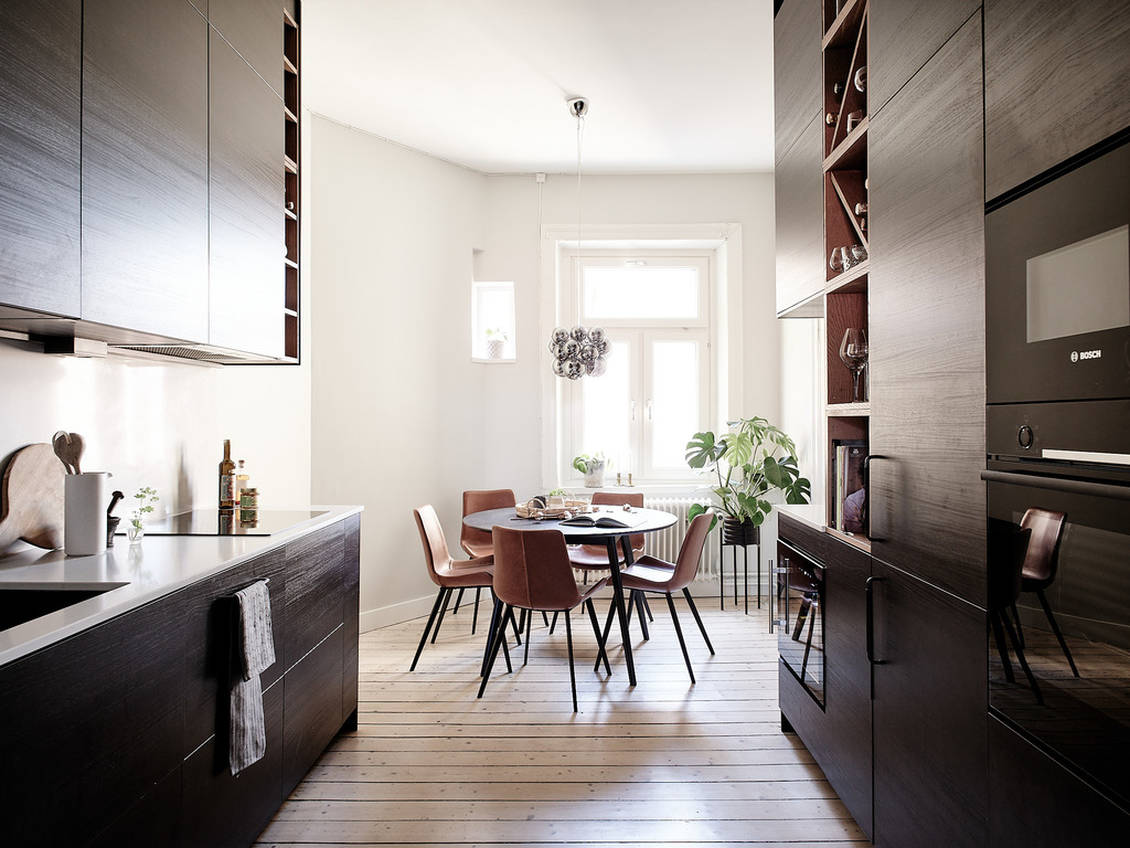
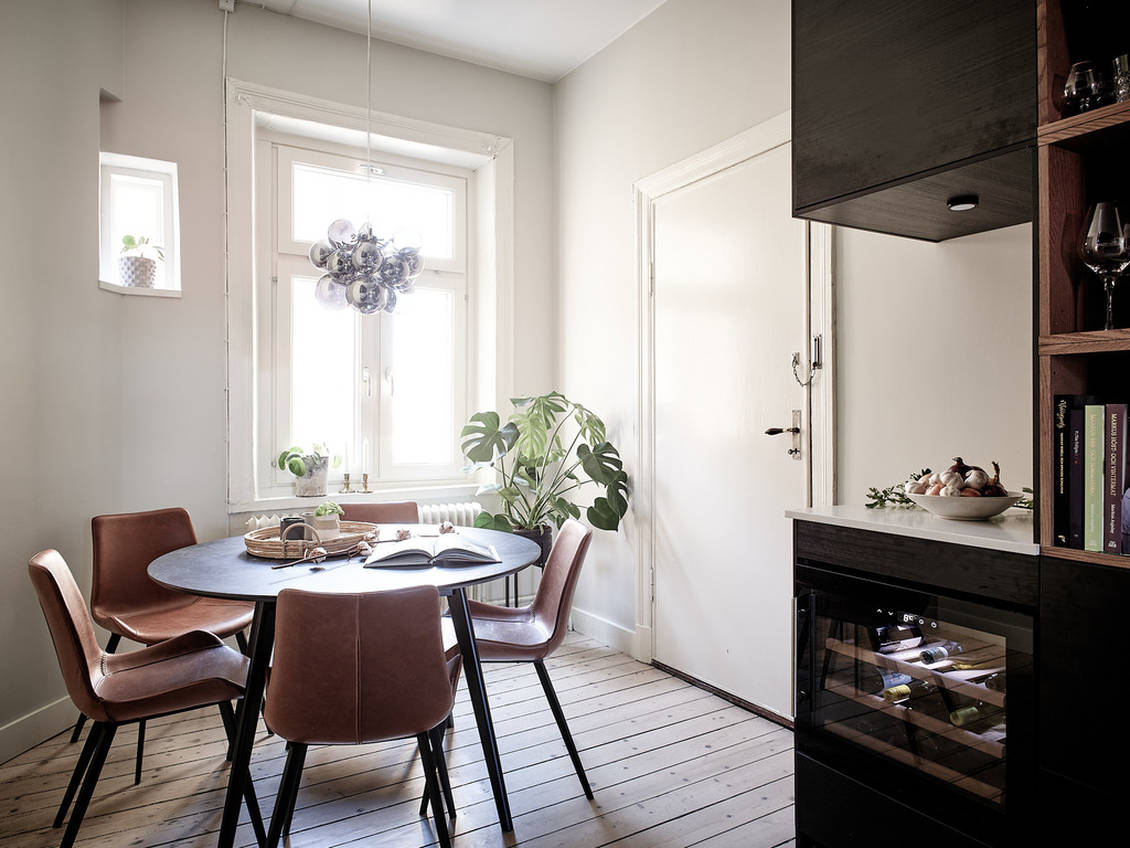
If we head to the kitchen, there we can see carefully selected pieces of furniture and decorations as well. Although the kitchens are the ones that are mostly overcrowded, full of things that do not work together or no longer serve the purpose they should serve, this one is example where everything works perfectly together and brings us feeling of calm. Our view travels through the whole room peacefully and nothing is overwhelming or unnecessary.
We hope you enjoyed our first virtual visit which we consider to be one of the perfect examples of what Capsule Homes can and should look like. Soon we are preparing a blog post with tipps & tricks on how to achieve harmony in the home and what to pay attention to when renovating one of the rooms or the whole home.
Until next reading,
xoxo, Capsule Home Team
The apartment is for sale through Stadshem agency.
Pictures: Stadshem